Katrina Olson

Strategic Communications

  • Clients
  • Products
  • Free Tools
  • About
  • Contact
  • Home
  • Consulting
  • Training
  • Coaching
  • Writing
  • Research
  • Podcast

Market Boldly 013 – Digital Transformation with Michael Evanko of Fromm Electric, Part 1

July 26, 2018 By Katrina Olson

Market Boldly
Market Boldly
Market Boldly 013 - Digital Transformation with Michael Evanko of Fromm Electric, Part 1
00:00 / 28:00
RSS Feed
Share
Link
Embed

Download file | Play in new window | Duration: 28:00 | Recorded on August 2, 2018

Join me with guest Michael Evanko, Vice President of Marketing for Fromm Electric Supply of Reading, Pennsylvania as we talk about Fromm’s digital transformation and how they’re navigating the challenges of technology. You’ll learn:

  • Why you need a technology roadmap (Hint: it will save you time and money!)
  • How to determine what you need in your marketing technology (martech) stack
  • Why implementing a CRM is not just about buying software
  • How technology makes customer information more easily accessible and readily available
  • Why it’s important to set goals before purchasing technology or software
  • How technology enables omnichannel marketing versus multichannel marketing

If you you’ve been struggling with how to get your company to embrace the digital age, this episode is for you. Watch for Part 2 for even more information to help your company begin its digital transformation.

Includes shout-outs to Rockwell Automation, WebPresented, Salesforce and Infor.

Tagged With: AD, advertising, affiliated distributors, April Braun, Best of the Best Marketing, big data, channel marketing, content, content marketing, content writing, CRM, data-driven marketing, digital transformation, distribution, distribution channel, electrical, electrical distribution, electrical manufacturing, electrical marketing, electrical sales, electrical wholesaling, katrina olson, katrina olson strategic communications, lighting, manufacturing, Market Boldly, marketing automation, marketing communications, marketing planning, marketing trends, NAED, Rockwell, tED Magazine, WebPresented, werner electric, WPCRM

And the Oscar goes to Owen from GE!

February 29, 2016 By Katrina Olson

Slide1

By Katrina Olson

This article originally appeared on tedmag.com on April 22, 2016.

At last year’s NAED AdVenture marketing conference, a whopping 60 percent of attendees were female, and approximately 43 percent were under age 36.

Contrast that with the demographics of electrical contractors.

The average age of the electrical contractor is 56.2, according to Electrical Contractor magazine’s 2014 Profile of the Electrical Contractor. And you probably won’t be surprised to learn that women hold only one percent of all electrician jobs, according to 2009 Census data.

“How do I market to people who are very different from me?”

A good marketer gets to know their customers, inside and out—who they are, what keeps them up at night, and how they make decisions. By understanding customers’ concerns, buying habits, attitudes, preferences and behaviors, you’ll get a feel for what kinds of media and messages they’ll respond to. Along the way, you’ll also learn about trends in their businesses and industry.

“How do I learn more about my customers?”

Following are seven ways you can find out what makes your customers tick. Some are pretty easy; others are more involved. But all should yield valuable insights..

1. Read your customers’ trade publications.

Most industries have trade association and publications. Health Facilities Management, Facilities Manger, Facility Management Decisions, Electrical Contractor, and Buildings and Electrical Contractor are just a few.

2. Join online groups.

Is there a LinkedIn group or social media platform where your customers and prospects hang out? Observe without participating or commenting to learn what’s important to them.

3. Ask your salespeople.

If you can’t talk directly to customers, talk to those who do. Counter staff, inside sales, outside sales, and customer service representatives can give you insight into what your customers care about.

4. Attend company events.

Get out from behind your desk or computer and attend counter days, workshops, training sessions, and other opportunities to get to know your customers. Try to uncover your customers’ hot buttons and pain points.

5. Contact customers directly.

Call or email some of your key customers and ask specific questions—like how they want to learn about new products and services. Or take them out to lunch. Explain that you want to better understand their business so you can better serve them.

6. Conduct a short survey.

Curious about what media your customers are consuming? Want to know what social media platforms they’re using? Wondering how much they use their smartphones? Ask them!

7. Host a focus group or customer advisory council.

To get honest feedback about what your customers think, conduct a focus group or establish a customer advisory council that meets every year. Rotate members out every few years to get fresh perspectives. (To make sure you get candid comments, hire an outside facilitator and leave the room.)

How can I apply this knowledge to be a better marketer?

Here’s an example. The electrical contractor’s role is evolving as they become more heavily involved in design and specification. Also, building systems are becoming more integrated and interdependent, using data hubs that communicate with each other. All systems are tied together; so all the products must be compatible with each other.

As a result, electrical contractors may look to you for comprehensive solutions, not just individual products. Electrical contractors will also rely more heavily on the electrical distributor’s expertise to help them choose the right products for both new and existing systems.

This knowledge should change the way you position and brand your company, and the way your salespeople are trained, too. Instead of just selling and marketing products, you’re marketing your staff’s expertise and product knowledge.

The trick is putting yourself in your customer’s and prospect’s shoes. That means not just understanding their wants and needs—but speaking their language. That takes a little more practice. But the more research you do, the easier it gets.

——————————

Olson is a marketing and public relations consultant, and principal of Katrina Olson Strategic Communications. She has written for tED magazine’s print edition since 2005, judged tED magazine’s Best of the Best Competition since 2006, and emceed the Best of the Best Awards ceremony for a total of seven years. She can be reached at Katrina@katrinaolson.com or via her website at katrinaolson.com

There’s a lot of chatter in the electrical manufacturing and distribution industry about hiring and retaining millennials. What does this have to do with marketing, you ask? Well, marketing is about reaching the right people with the right message at the right time.

In September 2015, GE launched this series of late-night TV commercials designed to recruit software developers for its Industrial Internet business by positioning GE as “The digital company. That’s also an industrial company.”

In the first three spots—part of a series titled, “What’s the matter with Owen?”—Owen tells his friends and family about his new job as a developer at GE . His friends and family are skeptical and less-than-enthusiastic in their responses. (Kind of like when I told my friend I was engaged to an engineer. She wrinkled her nose and said, “Oh.”)

Here’s the “What’s the matter with Owen?” spots:

Big News

The Hammer

Zazzies

Last night’s Oscars debuted three new spots featuring Owen’s friends who desperately want to work at GE now that they realize it’s a cool “digital industrial” company. The spots were posted by GE on YouTube just five days ago on Wednesday, 2/24. Here’s the campaign’s next phase, “The world is catching up with Owen”:

Orc-O-Gram

Ambush

 Brain Drone

The spots are not only entertaining—they’re effective. AdAge.com reported that the campaign resulted in a massive increase in resume submissions to the firm.

The spots are also running online, including GE’s website, YouTube, Facebook and other social channels. GE launched an internal campaign to generate excitement among employees, including sending emails to all employees named Owen first to build social chatter, according to Andy Goldberg, global creative director at GE (from AdAge.com).

What can we learn from Owen and GE?

  1. Millenials have a sense of humor, even about themselves.
  2. The electrical distribution industry needs to have a sense of humor about itself as well. Let’s face it. To most people, this is not a sexy industry.
  3. We have to reach millennials where they are. The old ways of recruiting will not work with them. For example, these spots ran on “The Late Show With Stephen Colbert” and during the Oscars.
  4. It helps to have a spokesperson with whom your audience can identify. (Let’s hope Owen is as squeaky clean as he appears.)
  5. Social media works—especially with millennials. It’s too early to tell with the new spots, but Owen is getting a lot of buzz on Twitter today!

Millennials are even tweeting selfies with Owen!

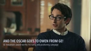
So the big question is: How you can apply this strategy to recruit millennials to your company? And if I can help, email me!

———————————————————————————————–

Katrina Olson is an award-winning advertising copywriter and creative director, marketing and public relations consultant, freelance writer, content developer, trainer/coach, former college professor, and principal of Katrina Olson Strategic Communications. She can be reached at katrina@katrinaolson.com or via her website at katrinaolson.com.

Filed Under: Blog Posts Tagged With: advertising, Creative

What Gets Your Attention?

September 14, 2015 By Katrina Olson

By Katrina Olson

This article originally appeared 9/14/2015 as an Exclusive Feature on tedmag.com.

What ads, direct mail pieces or commercials get your attention? What does it take to make you give up a few minutes of your time?

Professional marketers and advertisers have learned a few tricks for capturing the hearts and minds of readers, viewers and browsers. Here are a few of them.

How to make them stop in their tracks.

Do something unexpected. 
Instead of just talking or writing about your product’s features, find a unique way to demonstrate the benefit.

To show how easy it was to park with its new parking assist feature, Czech automaker Skoda used a clever “mechanical” device for its direct mail piece:

Go against the grain. If your competitors are using color, use black and white. If they’re using product shots in their ads, use people. If they’re cramming their ads full of type and pictures, use more visually appealing “white space.” (White space can also be black, blue or yellow. “White” just means blank.)If your competitors are still using banners or static (still) ads in the digital sphere, use motion. Try incorporating video, audio (or both), or using animated GIFs (graphic interchange format). All the cool kids have been watching GIFs on Tumblr for years.

In May 2015, Facebook started experimenting with GIFs as ads and Page posts. Here’s one created by Wendy’s to promote their fresh salads:


Solve a problem.
Find a pain point that resonates with your target market. Will your product save them time? Can you eliminate a frustration in their daily lives or jobs? Can you make an annoying part of their job less so? Can you eliminate or reduce a recurring problem?

Several years ago, Citibank recognized that consumers were frustrated when their recently purchased products suddenly failed. They created this TV ad to highlight the purchase protection features associated with Citibank credit cards:


Make it attractive.
Good design matters. It’s worth it to hire a graphic design firm, agency or freelancer to make your ads more visually appealing—and it costs a fraction of what you’re paying the media to run it.

Awhile back, I was pitching a new senior living community. The newspaper had been creating their ads. To show them the value of professional design, we did an “ambush makeover” on one of their ads:

We got the account and worked with them for several years.


Use shock value.
Use startling yet relevant claims, statistics, images, photos, videos or statements to get attention. But be careful – this strategy can backfire on you… Like this fake TV newscast about the release of previously rescued Snuffy the Seal back to the sea:

Some claimed the ad was in poor taste, calling it “disgusting” and “offensive.” One Facebook fan thought it was funny but admitted that it made his seven-year-old cry for 15 minutes afterward. Those reactions led to this follow-up commercial:


While I wouldn’t recommend this tactic, it does work. See below:

Meet Casey. We drove 80 miles, round trip, in a thunderstorm to get her—the same day my daughter saw the ad. (Although, I’m pretty sure this farmer from Danville was not just being clever.)


Make a promise.
Can you promise same-day service, free shipping, or guaranteed on-time delivery?

Beauty and weight-loss companies have been making the same promises for the past 50 years, according to a Huffington Post article. So it must work!


Tickle their funny bone.
Most people have a sense of humor. You can get their attention and build brand loyalty by making them chuckle.

To promote a zombie film festival, ad creators offered this handy piece of zombie-killing advice, “Don’t Panic. Aim for the Head.” Of course, we know zombies aren’t real… but just in case.


Appeal to Emotion
Emotion includes fear, disgust, empathy, love, sympathy… any strong feeling that you can evoke from your audience.

This advertiser made their somewhat mundane product incredibly special in their video, “World’s Toughest Job.”

What about you?

You’re probably thinking, “Sure, it’s easy to be creative when you’re promoting zombie festivals or cars, but my product isn’t quite that exciting.”

Your business, service or product is exciting to someone, or it wouldn’t exist. Find the inherent drama in your product, or create it by employing the tactics listed above. Good luck!

—————————–

Olson is a marketing and public relations consultant, and principal of Katrina Olson Strategic Communications. She has written for tED magazine’s print edition since 2005, judged tED magazine’s Best of the Best Competition since 2006, and emceed the Best of the Best Awards ceremony for a total of seven years. She can be reached at katrina@katrinaolson.com or via her website at katrinaolson.com.

Filed Under: Blog Posts Tagged With: advertising, creativity, writing

What’s Your Type?

August 3, 2015 By Katrina Olson

By Katrina Olson

This article originally appeared 8/3/2015 as an Exclusive Feature on tedmag.com.

The last of the “big three” tools in the graphic designer’s toolbox is typography—the art and technique of arranging words on a page to convey a desired look and feel in an ad, brochure, flyer, catalog, website, flyer, blog or other communication piece.

Typography—the font or typeface, size, capitalization, weight (thickness) or special treatments (i.e. bold, italic, outline)— is both functional and aesthetic. It needs to be legible, readable and attractive; and it needs to work with your design.

It’s easy to default to Times New Roman, which American Typographer Matthew Butterick says, “…is not a font choice so much as the absence of a font choice, like the blackness of deep space is not a color.”

However, by experimenting with typography, you can breathe new life into a case study or brochure. Font choices are as much a design element as color or visuals. As German designer Helmut Schmid said, “Typography needs to be audible. Typography needs to be felt. Typography needs to be experienced.”

Consider how the following fonts make you feel and where you might use them:

Okay, these were pretty obvious. Fortunately (or unfortunately), many large, established companies have branding guidelines or corporate identity standards that dictate specific fonts and provide logos to be used in all marketing materials.

However, for an independent company choosing a corporate font or updating a logo, the almost unlimited number of font choices makes it more complicated. In this case, it’s best to call in a graphic designer.

Whether you’re designing your logo or materials in-house, or working with a freelance graphic designer or agency, these tips will help you make good design choices.

Choosing and Using Type

Following are a few conventions and guidelines for using type in your marketing materials.

Choose an appropriate font.

Some fonts—like Goudy, Palatino and Garamond—are considered “Old Style.” They are are classic, traditional and readable. Others are more modern—like Bodoni and Didot—and are strong, stylish and dynamic. Sans-Serif fonts are based on geometric shapes and are minimalist in design. These fonts—which include Helvetica, Univers, Futura and Avant Garde—are clear and objective; but they can also come off as cold, impersonal and boring.


https://visualdesignstudio.files.wordpress.com/2011/07/typography_poster_by_kidcasanova.png

When considering your options, choose a font that:

  • best reflects the personality and brand of your company;
  • reproduces well in various sizes and applications (print, web, etc.); and
  • offers a variety of options (bold, italic, condensed, narrow, expanded, etc.)

Once you’ve chosen a font, stick with it. This will give your materials a consistent look and feel (along with consistent use of color and images).

Pick one: correspondence or contrast.

Correspondence and contrast are general principals of design. Correspondence means things look good together because they are similar. Contrast means they are so different—and sufficiently different—that they look good together.

Contrast:  Garamond & Helvetica

Correspondence:  Perpetua & Gill Sans

Garamond and Helvetica work together because they are so noticeably different. Garamond is an older style font with “serifs” (a small line attached to the end of a stroke in a letter) while Helvetica is a more contemporary font with no serifs.

Perpetua and Gill Sans work together because they are similar in style. If you look at the entire alphabet for each, you’ll notice the a, m, n, r and t in both fonts are very similar. To achieve correspondence, graphic designers will often choose fonts from the same time period, with the same height or weight, or from the same designer.

If that’s too complicated, opt for contrast. Choose one san serif (font without serifs, such as Gill Sans) for headlines, short copy and web copy; and another serif font (like Garamond or Palatino) for body copy in brochures, ads and other long documents.

Notice that this ad uses a serif font for the headline and a san serif font for the body copy. On a related note, for years we’ve heard that serif fonts are easier to read than san serif fonts. But recent research has debunked this myth. If you’re fascinated by this debate or want to win an argument with your fellow designers or boss, see this blog: http://alexpoole.info/blog/which-are-more-legible-serif-or-sans-serif-typefaces/#part2

Follow the “less is more” principle, especially with display fonts.

Remember those funky fonts from the beginning of the article? They’re called display fonts. They’re cute and kitschy and would look adorable on your kid’s birthday invitation. But use them sparingly in business… or not at all.

Obey the rules… or don’t.

Fonts literally come in all shapes and sizes; some have thick lines; some have thin lines. Some are narrower, taking up less space; others are wider, taking up more space. Some are older; some are more contemporary. Some are taller and some are shorter.

Certainly, there are guidelines and conventions about using type. But if you follow them, your pieces will look like everyone else’s. Talented designers know and understand the rules and why they exist—and they know how to break them and still make a piece look good.

———————————–

Olson is a veteran marketing and public relations consultant. She has written for tED magazine’s print edition since 2005, judged tED magazine’s Best of the Best Competition since 2006, and emceed the Best of the Best Awards ceremony for a total of seven years. Reach her at katrina@olsonmarketing.net or at olsonmarketing.net.

Filed Under: Blog Posts Tagged With: advertising, creativity, design, marketing, typology

Picture Your Ads With Photos, Illustrations and Images

July 27, 2015 By Katrina Olson

By Katrina Olson

This article originally appeared 7/27/2015 as an Exclusive Feature on tedmag.com.

Last week we talked about using color in advertising. But that’s just one of the “big three” tools in the graphic designer’s toolbox. Another is visuals.

A picture in a print layout captures more than twice as many readers as a headline does. And the bigger the image, the more attention the message grabs. Further, visuals draw more readers into the body copy than just a headline does—and people remember layouts with pictures more readily than those with mostly type.
What about digital content? Following are a few facts based on research conducted by MDG Advertising:

  • Digital/social content with compelling images attracts 94% more total views on average than content without.
  • 67% of consumers consider clear, detailed images to be very important and carry even more weight than the product information, full description, and customer ratings.
  • When Facebook posts include photographs, they see a 37% increase in engagement.

In short, visuals help create more attention-getting, interesting, memorable and believable marketing messages. Here’s how.
Visuals grab attention.
Advertisers use many different types of imagery to get attention. Sometimes it’s as simple as a product shot, especially when the audience is actively seeking information. Other times, they have to work a little harder and use babies, children, animals, celebrities, cultural icons (e.g. Washington Monument) or distorted images (e.g. oversized heads).

This highly “visual” billboard appeared on the Marina City Towers building in Chicago in 2008 to advertise Allstate’s accident forgiveness policy.

The ad was part of a campaign that also included magazine and TV ads showing a car plunging into the Chicago River.
You don’t have to hang a car off a building to get attention. But you can dramatize a feature or benefit of your brand to get attention. If your product saves time, focus on a watch or clock, for example.

Visuals enhance memory of the ad.
Think about every TV ad you’ve seen for Target. The red and white logo is always a focal point, helping you remember the brand. When you see a UPS ad, the color brown and images of their trucks are usually prominently featured.

Since this ad in 1980, Absolut Vodka has consistently included a picture, shape or otherwise “adapted” image of the bottle in their ads. For more, go to http://www.buzzfeed.com/copyranter/the-best-of-the-great-absolut-ads.

To get the most bang for your buck, use a similar style of imagery in all your marketing. For example, don’t switch back and forth between illustrations and photos, or product shots and people. The key is consistency—maintaining a familiar look and feel.

Visuals communicate quickly.
Research by 3M Corporation concluded that we process visuals 60,000 times faster than text. Think about it. When you’re hustling through an airport to catch a flight, but you need a restroom break, what do you look for? Most people look for these symbols:

Okay, maybe something similar. What images do people instantly associate with your brand? Is it the product, a building or a local landmark? What visuals can you capitalize on appropriate (borrow) to signify your brand?

Visuals can reinforce the written message.
Sometimes words aren’t enough. But when used with images, they’re more powerful. The combination of visuals and words make messages easier to comprehend and remember than text alone, according to Robert Horn, Stanford University scholar.

If you’ve fallen recently and you’re over 30, you might remember this one:


Try to visually demonstrate a benefit for the customer in addition to telling them. As much as we all hated the Life Call/Life Alert, “I’ve fallen and I can’t get up” commercials of the late 1980s, they’re still parodied today.

Visuals can demonstrate abstract concepts.
How do you demonstrate the effectiveness of an antiperspirant/deodorant? It’s not easy…because if the product works, you don’t notice.


Sure used the image of people raising their hands to illustrate the confidence felt by people who used its product.

How can you demonstrate trust, loyalty, dependability, selection, expertise or whatever unique and important (to the customer) benefit your brand offers?

Visuals can anchor brand associations.
To stand out in a crowded marketplace of “me too” products, connect your product to a lifestyle, image or type of user. For over 15 years, Gatorade has associated its brand with intense, highly competitive athletes like Michael Jordan, Derek Jeter, Dwayne Wade and Peyton Manning.

Can’t afford to hire professional athletes? You can still associate your brand with hard-working electricians, savvy contractors or family business owners. Or you can associate it with concepts like trust, reliability or partnership; then use images and copy in your marketing materials to support that association.

Visuals can tell stories.
Remember this 2015 Super Bowl commercial? The only words were the lyrics from a cover of The Proclaimers’ “I’m Gonna Be (500 Miles).” The visuals told the story.


What’s your story? Is it about how you solved a problem for a customer? Or how you saved the day by making a special delivery to a job site? Try your hand at visual storytelling—a trendy, new buzzword that’s the modern-day equivalent of prehistoric cave drawings. Only now we do it with pictures and video.

Images make marketing more interesting.
This Nationwide Insurance uses an oversized baby to represent a car. It’s interesting…and a little creepy.


What comparisons, analogies or associations can you make to add interest to your marketing pieces? (Make sure they’re images your customers can relate to.)

When and where to use visuals.

When? Anytime! Where? Everywhere! Don’t limit your use of visuals to your ads, website and Facebook page. Use visuals in your blog posts, newsletters, fliers, slide presentations, sales literature, tweets, LinkedIn posts and anywhere you communicate with customers.

—————————————–

Olson is a veteran marketing and public relations consultant. She has written for tED magazine’s print edition since 2005, judged tED magazine’s Best of the Best Competition since 2006, and emceed the Best of the Best Awards ceremony for a total of seven years. Reach her at katrina@katrinaolson.com.

Filed Under: Blog Posts Tagged With: advertising, creativity, design, marketing, writing

Color Me Happy, Loyal or Trustworthy

July 20, 2015 By Katrina Olson

By Katrina Olson

This article originally appeared 7/20/2015 as an Exclusive Feature on tedmag.com.

We’ve been talking a lot about writing, content and strategy.  So, I thought we’d take a break to talk about something we don’t often think about in marketing…color.  Did you know that different colors carry different meanings?


Green is a calm and restful color. It traditionally conveys images of freshness, nature, fertility, the environment and safety. Greed, jealousy and luck are also emotions attached to the color green.

Green is often used with medical products to inspire hope, safety and healing. Banks often use dark green because it is associated with greed, money and stability.


Blue is a masculine color; it’s also calm and symbolizes trust, loyalty, wisdom, confidence, intelligence, faith, truth, integrity and harmony. Its deeper tones are associated with depth, expertise and stability.

Blue is often used to promote products and services related to cleanliness, and to indicate precision when promoting technology products.


Red is an emotionally intense color. It exudes passion, love, energy, danger, strength, power, and determination. In Eastern cultures, red represents good luck.

Red is a highly visible color, used to stimulate quick decisions with “click here” or “buy now” buttons, on banners, or promoting products related to safety or energy. Red also makes elements pop, bringing them to the foreground.


Purple is a rare and somewhat artificial color, so use it cautiously. Usually associated with royalty, power or extravagance, purple also stands for independence, wisdom, dignity, creativity, inspiration, mystery and magic.

Use purple cautiously as light purple evokes feelings of nostalgia and romance, while dark purple evokes gloom, sadness and frustration.

Children’s products often use purple, as 75% of pre-adolescent children prefer purple to all other colors.


Yellow is a pleasant and happy color that produces a warming effect, arousing feelings of cheerfulness and conveying happiness and joy. Yellow is said to generate muscle energy and stimulate mental activity.

Often used by taxicabs, yellow captures attention. But it’s also considered unstable, spontaneous and childish, so don’t use yellow to indicate stability and safety. Dull shades of yellow are visually unappealing; dingy yellow represents decay, sickness and jealousy.

However, yellow is good for highlighting or drawing attention to an element, especially when contrasted with a dark color.


Orange combines the energy of red and happiness of yellow. It’s a “hot” color but not as aggressive as red. Orange increases oxygen supply to the brain, invigorating it and stimulating mental activity.

Young people prefer orange which is often associated with healthy food or harvest time and supposedly stimulates appetite. Orange symbolizes friendship, strength, endurance, enthusiasm, fascination, creativity, determination, attraction, success and encouragement.

Sports teams, toys and fast food restaurants often use orange. It’s also useful for catching attention and highlighting important design elements in contrast to dark colors.


Pink is a feminine color, often implying romance and love. It also symbolizes nurturing and compassion, and is often associated with women.

It is used to promote breast cancer awareness and products supporting this effort. (In fact, a cement company in my city actually has pink trucks!) Perhaps surprisingly, pink has not always been a “girly” color. Back in the 1700s, men and women wore pink.


White is a wholesome color, often associated with light, goodness, innocence, safety purity, and cleanliness. Unlike black, white has a positive connotation and symbolizes perfection.

White is also used for charitable organizations, foundations and hospitals and is associated with angels, brides, newness and “good guys” wearing white hats.

Use white to suggest simplicity in processes or technology, or to indicate “newness” or a beginning of something.


Gray is a neutral color that is considered impartial, sometimes sterile. No major emotions are connected to gray, although it reminds some people of clouds or overcast skies.


Black is the color of death, grief and evil…but also elegance, power, formality and mystery. While it often carries a negative connotation, black also represents strength and authority.

Use black to highlight perspective and depth, and to make other, highly contrasting colors like yellow or orange stand out.

Although reverse layouts (white type or elements on a black background) are unique and attention getting, use them sparingly and carefully. Especially in newspaper printing, the black ink often bleeds onto the white, making your copy difficult to read.

Just don’t color me bad(d).

If your company logo is only one or two colors, consider adding one or two complementary colors to liven up your marketing pieces or for specific campaigns. Just be cautious when choosing colors; you don’t want to makes customers sad with dark purple or nauseate them with dingy yellow.

———————-

Olson is a veteran marketing and public relations consultant. She has written for tED magazine’s print edition since 2005, judged tED magazine’s Best of the Best Competition since 2006, and emceed the Best of the Best Awards ceremony for a total of seven years. Reach her at katrina@katrinaolson.com.

Filed Under: Blog Posts Tagged With: advertising, color, creativity, design

Explore

  • Home
  • Consulting
  • Training
  • Coaching
  • Writing
  • Research
  • Podcast

About

Katrina is a seasoned marketing consultant, trainer and coach; content strategist and writer; social/digital media enthusiast; and podcaster who is committed to helping nimble electrical distributors, electrical manufacturers, and other B2B companies achieve their sales, marketing, and business goals.

Contact

Katrina Olson Marketing + Training
1096 County Road 1800 East
Urbana, IL 61802  | 217-721-1679

PR-Daily Award
Hermes Award
Dotcomm Award
2018 AVA Digital Awards bug
Hermes Award Bug Gold 2018
2018_dotcomm_site bug_gold
2019 DotComm Gold Award Bug

© 2017 Katrina Olson. Powered by NeuConcept